PowerBI Dashboards: Transforming Data into Actionable Insights
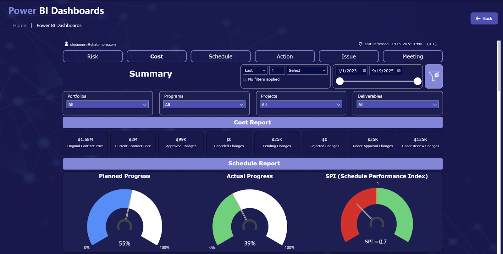
Power BI dashboards are powerful tools that enable organizations to visualize and interact with their data, facilitating informed decision-making. A dashboard in Power BI is a single-page, often referred to as a canvas, that aggregates and displays key metrics and insights through various visualizations, known as tiles. These tiles can represent data from multiple reports and datasets, providing a consolidated view of business performance.
Key Features of Power BI Dashboards:
Single-Page View: Dashboards are designed to provide a snapshot of important metrics on one page, allowing users to quickly assess the health and performance of their business. This single-page limitation encourages the inclusion of only the most critical information, ensuring clarity and focus.
Interactive Tiles: Each visualization on a dashboard is called a tile. These tiles are interactive and can be pinned from reports, other dashboards, Excel, or created using Power BI's Q&A feature. Selecting a tile often directs users to the underlying report or dataset, enabling deeper analysis.
Real-Time Data: Dashboards can display real-time data, allowing organizations to monitor live metrics and respond promptly to changes. This is particularly useful for tracking sales performance, customer engagement, or operational processes as they happen.
Customization: Users can customize dashboards by adding images, text boxes, and even embedding videos. This flexibility ensures that dashboards can be tailored to meet specific organizational needs and branding guidelines.
Data Integration: Power BI dashboards can integrate data from various sources, both on-premises and cloud-based, providing a comprehensive view of the organization's data landscape. This integration capability ensures that all relevant data is accessible and visualized in one place.
Creating a Power BI Dashboard:
Building a dashboard in Power BI involves several steps:
Prepare Your Data: Ensure that your data is clean and well-structured. This may involve data cleansing and transformation using Power Query. For Excel data, confirm that it is in a flat table format with appropriate data types and a header row.
Build a Report: Connect to your data source and create a report in Power BI Desktop or the Power BI Service. Design visualizations that represent your data insights effectively. Utilize various chart types, maps, and other visuals to convey information clearly.
Pin Visuals to the Dashboard: Once your report is ready, pin the most important visuals to a new or existing dashboard. This action creates tiles on the dashboard that link back to the original report, allowing for interactive exploration.
Customize the Dashboard: Arrange the tiles to create a logical and aesthetically pleasing layout. Add any additional elements such as images, text boxes, or videos to enhance the dashboard's utility and appearance.
Share the Dashboard: After finalizing the dashboard, share it with stakeholders by providing access through the Power BI Service. Ensure that recipients have the necessary permissions to view and interact with the dashboard.
Dashboards vs. Reports:
It's important to distinguish between dashboards and reports in Power BI:
Dashboards: A single-page view that aggregates visualizations from multiple reports and datasets. Dashboards are ideal for monitoring key metrics at a glance.
Reports: Multi-page documents that provide detailed data analysis. Reports are based on a single dataset and offer extensive filtering, slicing, and drilling capabilities.
Best Practices for Effective Dashboards:
Keep It Focused: Include only the most critical metrics to avoid clutter and ensure the dashboard remains easy to interpret.
Ensure Clarity: Use clear labels, legends, and titles for all visualizations to enhance understanding.
Maintain Consistency: Use consistent colors, fonts, and design elements to create a cohesive look and feel.
Optimize for Performance: Limit the number of visuals to ensure the dashboard loads quickly and performs efficiently.
Design for Your Audience: Consider the needs and preferences of your audience when designing the dashboard to ensure it meets their requirements.
In conclusion, Power BI dashboards are invaluable tools for organizations seeking to visualize data and monitor key performance indicators effectively. By following best practices in design and leveraging Power BI's robust features, businesses can create insightful and interactive dashboards that drive informed decision-making.

Comments
Post a Comment